 Measure Killer
Power BI reports inventory
Every Power BI report in the tenant — pages, views, load times, custom visuals, report-level measures, and subscriptions — with 28-day consumption data.
Last updated · July 27, 2026
What you get
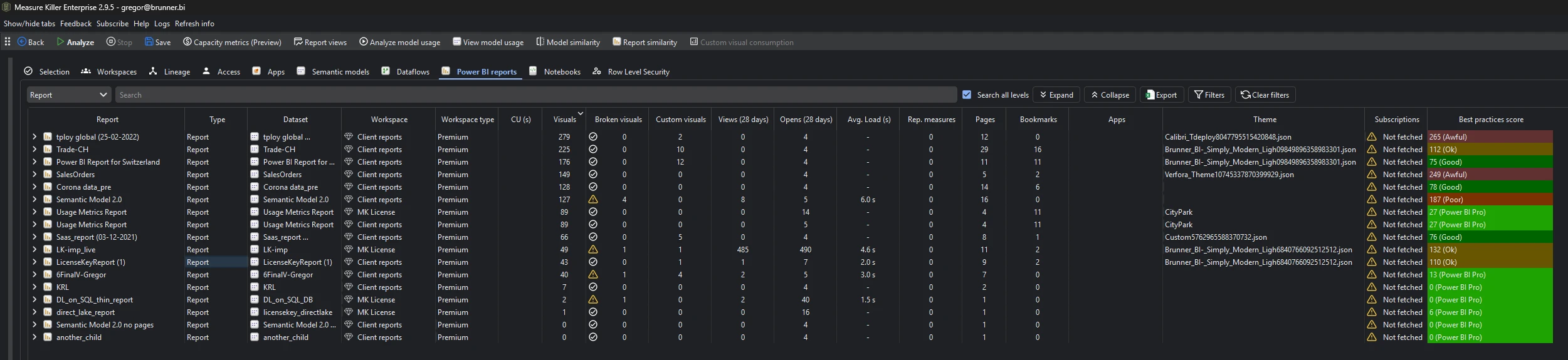
Every Power BI report scanned, with columns for:
- Name and workspace
- Connected semantic model — which model the report reads from (see Semantic models inventory)
- Page count — number of pages in the report
- Owner / last modified by
- Opens and Views — two 28-day consumption columns, auto-fetched when Get report page views and load times is enabled in the pre-filters for the scan (not from the Activity logs action). Opens counts actual report open events; Views is the report’s aggregated page views over the same window. Both always show the default 28-day window; Measure Killer keeps a longer history in its local database, which you read from the Report views window, not these columns
- Average load time — how long the report takes to fully render, averaged per user. See Report load times for the performance deep-dive
- Custom visuals — count of certified vs. non-certified custom visuals. See Custom visual consumption
- Report-level measures — count of measures defined at the report level (rather than in the model)
- Report subscriptions — open the Subscriptions button for a tenant-wide list of subscriptions, owners and recipients. See Report subscriptions
- CU (s) (new in v2.9.5) — the report’s Capacity Unit consumption. For a report, this is driven largely by its subscriptions: each scheduled render is charged against the report, so a high CU figure here usually points back to frequent subscription sends. Populated after fetching Capacity metrics — cross-reference with Report subscriptions
- Broken visuals (new in v2.9.5) — how many visuals in the report currently render an error instead of data. Populates after Phase 3, not straight after Phase 2 — until then the column shows N/A, which means no count available, not zero. Phase 3 (Analyze model usage) runs per semantic model, so reports whose model wasn’t included stay N/A until you analyze it; N/A can also mean an error occurred while processing the model or the report. Right-click a report or page and choose View broken visuals to see which visuals broke, on which pages, and why. See Find broken visuals
These columns show the default window. Opens, views, and average load time reflect the last 28 days; CU (s) the last 14 days — the windows Microsoft exposes. The longer history Measure Killer accumulates is read from the dedicated Report views and Capacity metrics windows, not from these columns.
Run the analysis
- Run a tenant-wide scan and complete Phase 2 by selecting items and clicking Analyze.
- Switch to the Power BI reports tab.
- Sort, filter, or search by any column.
Common workflows
- Find unused reports. Sort by Opens (ascending) to find reports with zero opens in the last 28 days. Cross-reference with the connected semantic model — if the model is also unused, both are candidates for cleanup.
- Identify slow reports. Sort by Average load time (descending) to find reports that take the longest to render. Reports above 5–10 seconds are worth investigating. See Report load times for the full performance workflow.
- Audit report-level measures. Filter for reports with report-level measures. These measures are defined inside the report rather than in the semantic model, making them invisible to other reports and harder to govern. Consider moving them to the model.
- Custom visual compliance. Review which reports use custom visuals and whether those visuals are certified. Non-certified custom visuals may pose security or support risks. See Custom visual consumption for the full security, licensing and compliance workflow.
- Subscription audit. Open the Subscriptions button to see who receives each report — including external / unresolved recipients who may not have access — and the high-frequency subscriptions that quietly consume capacity. See Report subscriptions.
- Find broken visuals. Sort the Broken visuals column (descending) to surface reports whose visuals render errors instead of data — then right-click to see exactly which visuals broke and why. See Find broken visuals.
What to do with the findings
- Export to Excel — click Export in the toolbar to export the full report inventory to Excel for usage reviews or governance reporting.
- Export as JSON — paid editions can also export as raw JSON for integration with governance dashboards or usage analytics.
- Run report similarity — use Report similarity to find duplicate or near-duplicate reports across the tenant.
- Share the
.measurekillerfile — hand the scan to a colleague for review.
Related
- Find broken visuals — the Broken visuals column in detail: which visuals broke, where, and why
- Report views & opens — page-level consumption data, long-term retention beyond 28 days, and export options
- Report load times — average render time per user — find slow reports and track performance over time
- Report similarity score — find duplicate reports
- Custom visual consumption — which custom visuals each report uses, certification and license compliance
- Report subscriptions — tenant-wide subscription audit: recipients, frequency, and the access / capacity risks
- Best-practice analysis — report-level rule violations
- Semantic models inventory — the models these reports connect to
- Run a tenant-wide scan — the scan that populates this tab