 Measure Killer
Dependency tree
Drill into what every report, page, visual and measure consumes from your model — and how much space you'd save by removing each one.
Last updated · July 15, 2026
What it is
The Dependency tree walks the dependency graph linking your semantic model to the reports, pages, visuals, measures and columns built on top of it. The walk is always downward — from a report through its pages and visuals to the measures and columns they consume. For every node it reports two things: how much of the model that node actually touches, and how many bytes you’d reclaim if you deleted it.
It’s the counterpart to the Where-used table. Where-used gives you a yes/no on a single column (“is this used, and by what?”). The Dependency tree answers the harder question a dev actually acts on: “what does this element pull in, and what does removing it genuinely free up?” The same numbers also work as a refactoring map when you’re splitting an overgrown shared model.
Because the walk resolves every measure and column down to the exact visuals that consume it, the Dependency tree is column-level lineage inside the model — the model-to-visual half of Measure Killer’s end-to-end data lineage.
Picking a mode
The mode you choose sets the entry point for the walk — the grain at which savings are aggregated. Full view keeps the whole hierarchy on screen; the other four collapse it to a flat list of one element type (report, page, visual or measure) ranked by impact. Pick the grain that matches the thing you’re deciding whether to delete.
The five modes, one by one:
Full view
Full view keeps the entire hierarchy expandable in one tree — model and report at the top, drilling down through pages and visuals to individual measures and columns. From any node you can:
- Expand a visual to see every measure and column it uses, then expand those measures to see the columns they reference, recursively down the chain.
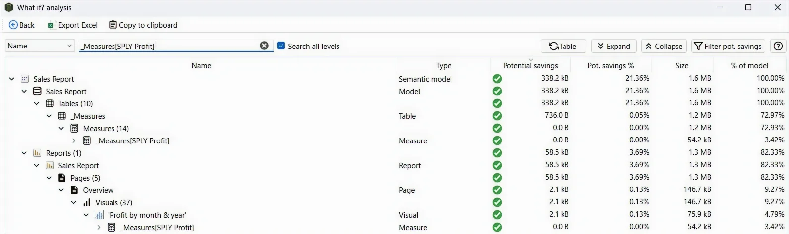
- Search a column or measure name to highlight every place it’s reached, directly or transitively, anywhere in the report or model.
Report mode
When one model feeds several reports, Report mode lists each report with two figures: its total footprint in the model, and the slice of that footprint that only it uses. The exclusive slice is the Potential savings — delete the report and those columns become genuinely orphaned, so the model shrinks by that amount. Columns the report shares with any other report don’t count, because they’d survive the deletion.
Report nodes show report-layer usage only. The columns and measures listed under a report (and under its pages and visuals) are what those layers reference directly — a functioning model is assumed as a prerequisite. A column the report never touches but that the model needs, say to hold a relationship together, won’t appear under the report; it shows up under the semantic model’s relationship section instead. So a report’s list is not the full set of columns required to render it — it’s what the report layer adds on top of the model.
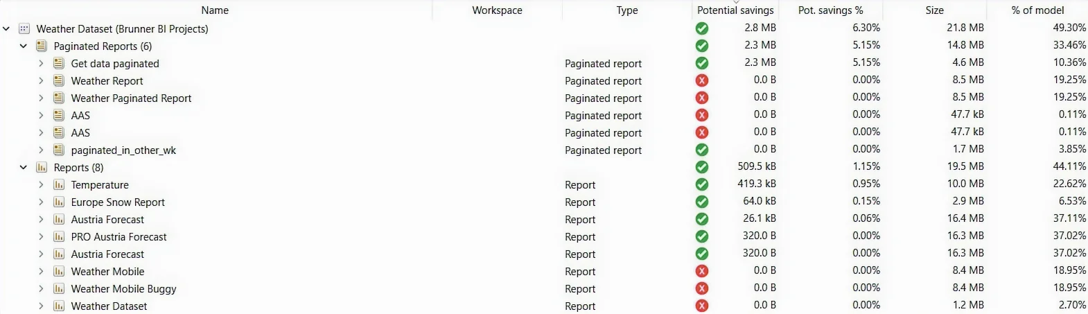
In the example above, Get data paginated exclusively consumes 5.15% of the model — every column it relies on is untouched by any other report, so deleting the report reclaims the full 5.15%.
Slicing an overgrown shared model
Cleanup isn’t the only use for these numbers. When one massive model feeds dozens of reports, the per-report consumption figures double as a complexity map: they show at a glance which reports are heavy consumers and which barely scratch the surface. That’s exactly the information you need to plan a split — reports that consume small, disjoint slices of the model are natural candidates to move onto their own smaller, focused models, while the heavy overlapping consumers stay on the shared core. This comes from real-world practice: it’s how we’ve used the Dependency tree to break up an oversized model in production.
Page mode
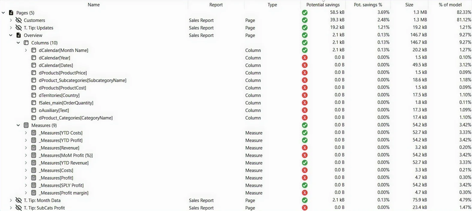
Same exclusive-usage logic, one level deeper: every page across every report, ranked by its own potential savings. This is where you catch the single page that’s the sole reason a long tail of columns stays in the model.
Visual mode
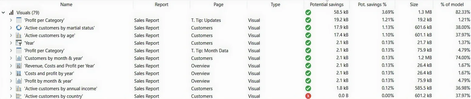
One level deeper again: every visual on every page, with the columns and measures it consumes and its exclusive savings. Use it to find the lone visual pinning a heavy column in place — often a leftover card or tooltip no one would miss.
Measure mode
Measures never have a real size in a semantic model — they’re just DAX expressions — so the size shown here is deliberately fictitious: the summed on-disk size of every column the measure resolves to, directly or through other measures it calls. It exists to rank measures by how much storage they drag in, not to be read as a literal byte count.

How Potential savings is calculated
Potential savings appears in every mode and answers one question: delete this row, how many bytes come back? It sums the on-disk size of every column reachable only through that element — including columns pulled in transitively by the measures and calculated columns it uses. The word doing the work is only: a column shared with any other element survives the deletion, so it never counts toward savings. The same goes for the model itself — a column the model needs, for example in a relationship, is never counted in any report’s, page’s or visual’s savings, no matter how exclusively that element uses it in the report layer.
Comparing weight vs. simulating a cleanup. The Dependency tree’s job is to show how heavy reports, pages and visuals are relative to each other. If you want the true answer to “how small could this model get if it only had to serve one of its four reports?”, run an online scan of the shared model and select just that one report. That analysis accounts for everything the model needs plus everything the selected report needs — so its unused results are exactly what you could clean up in that scenario.
Related
- Find and remove unused measures and columns — the workflow that turns Dependency tree insights into a smaller model
- End-to-end data lineage in Power BI — tenant-wide lineage, one level up from the per-model Dependency tree
- Best-practice analysis (reports + models) — other cleanup signals beyond unused / used