 Measure Killer
Finding similar or duplicate reports in Power BI and Microsoft Fabric
Report sprawl is classic self-service tech debt. A similarity score across pages, visuals, filters, and bookmarks turns it into something you can clean up.
The challenge
Especially in self-service BI scenarios, it’s common for teams to create new reports for every specific use case, often not checking (or being able to check) if a similar report already exists.
Over time, this leads to a sprawl of similar reports that differ in filters, visuals, or formatting. Having so many similar reports increases the risk of losing control and creating a ton of redundancy.
How we compare reports today
Even if I look at two very similar reports from a .pbip or .pbir point of
view, it’s still very difficult to determine the actual differences (PBIR
format for Power BI reports).
For PBIX reports it is near-impossible.
While PBIR slightly improves things, pinpointing the main differences between reports is still difficult and usually limited to comparing two reports at a time. That makes the approach hard to scale and ineffective at objectively measuring report similarity.
Introducing Report Similarity in Measure Killer
To solve this, we added a new feature to Measure Killer called Report Similarity. When analyzing reports, Measure Killer collects a lot of metadata which it organizes in a structured way. With that information, it is possible to compare reports in a very intricate and customizable way.
Report Similarity evaluates reports across multiple attributes and assigns a similarity score to each comparison. This score tells you how closely two reports resemble each other, while still letting you drill into the exact differences that contribute to that score.
The comparison includes attributes like:
- Name
- Description
- All pages
- All custom visuals
- All report-level measures
- All filters (report-level, page-level and visual-level)
- All bookmarks
- And many more traits
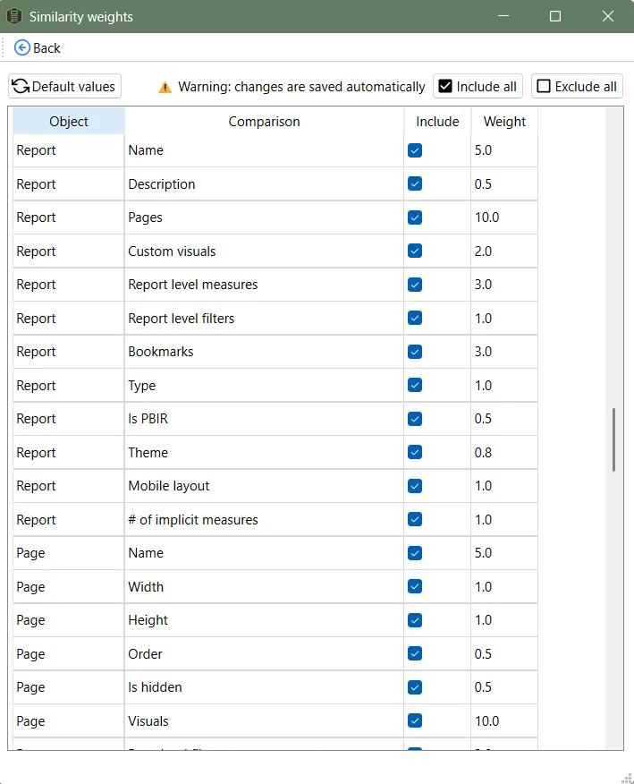
Each attribute can be disabled or enabled and different weights can be set to rank their importance - allowing comparisons in almost any way you can think of.
Getting started with Report Similarity
To get to this feature, select either the Tenant Analysis or Limited Tenant Analysis modes in Measure Killer’s start window and analyze the reports you want to compare. Afterwards, click on the Report similarity button located on the top - it will be enabled as soon as you’ve run a Power BI report via the Selection tab.
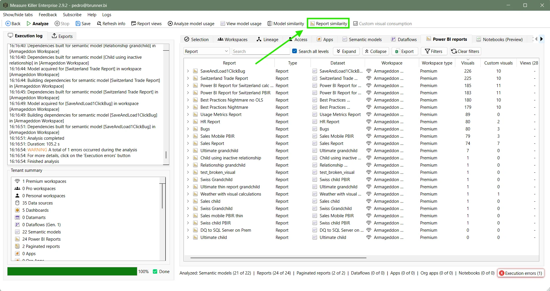
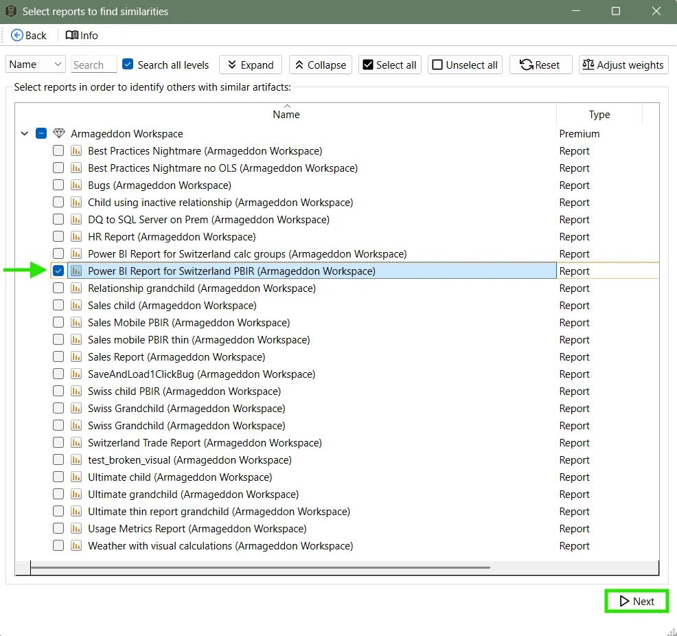
Now you can select the reports you want to find similar ones for:
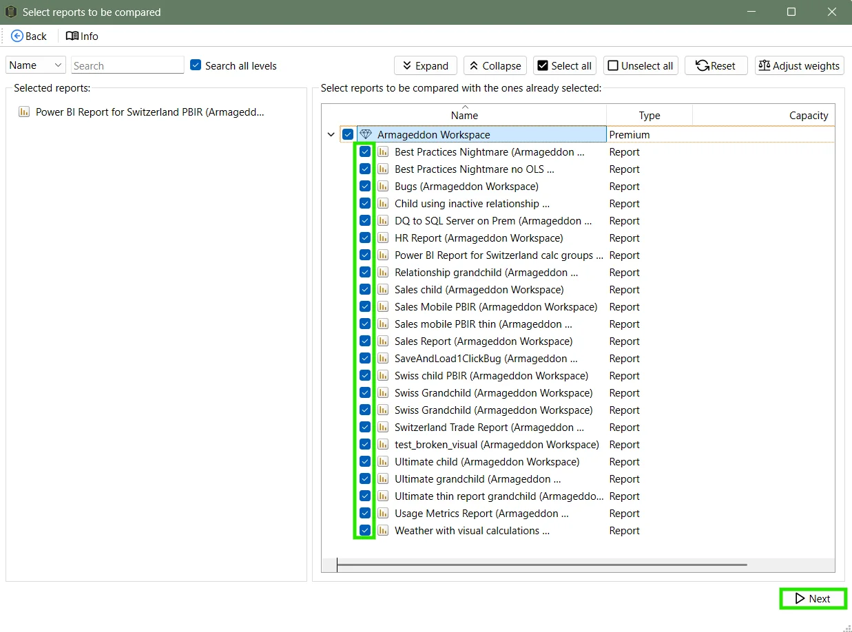
In the next window, you’ll be able to select the reports to compare with.
In our case we want to compare the Power BI Report for Switzerland PBIR with all other reports we have access to, to see if any of them is very similar.
Understanding the results
After that, Measure Killer assigns a similarity score between every pair of reports. The higher the score, the more similar the reports are.
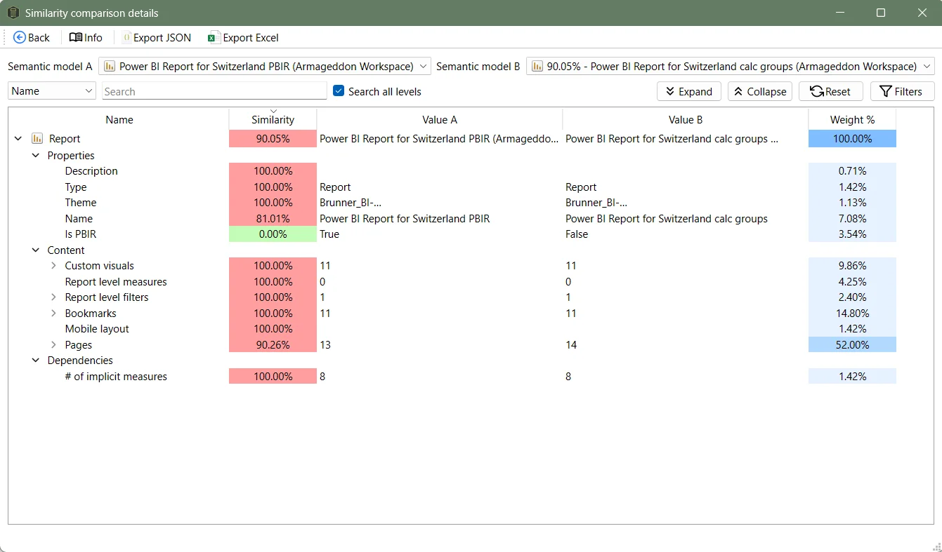
To see what exactly is similar and what is different, open Similarity details.
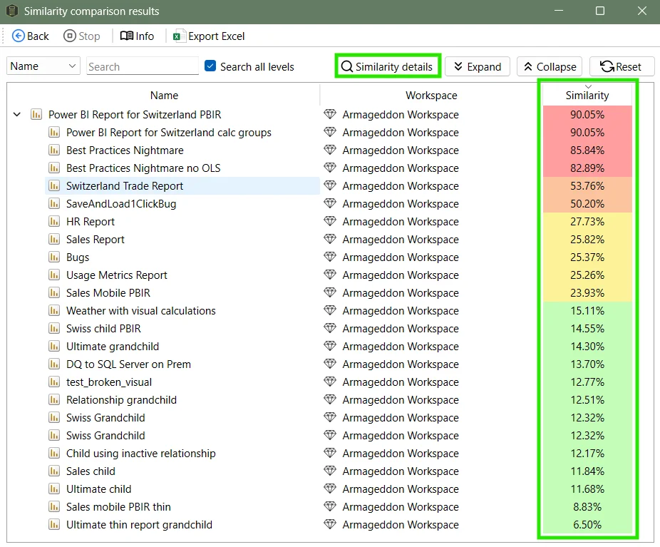
Similarity scores use a red-to-green color scale, with red signaling high similarity - which is typically a bad sign. In this example, the Power BI Report for Switzerland PBIR has an almost identical report called Power BI Report for Switzerland calc groups:
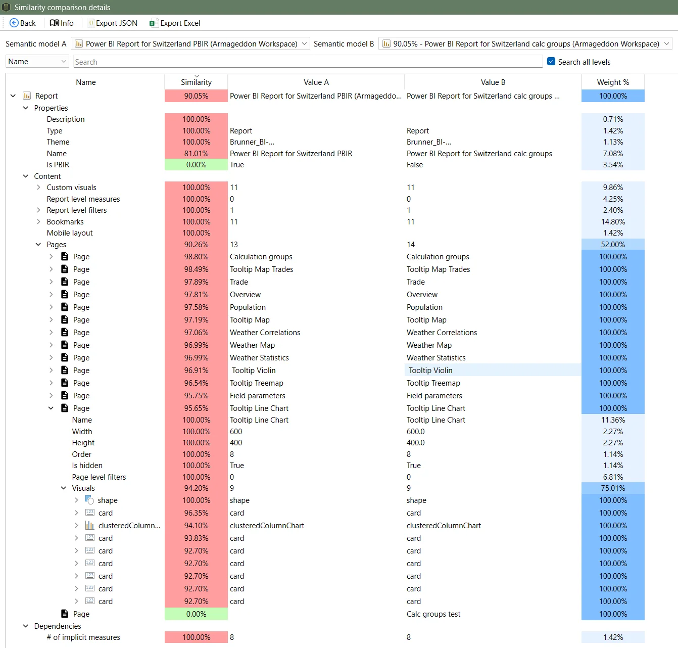
Power BI Report for Switzerland calc groups is basically an exact copy of the original Power BI Report for Switzerland PBIR, just not in the PBIR format. Expanding some of the items shows the small differences.
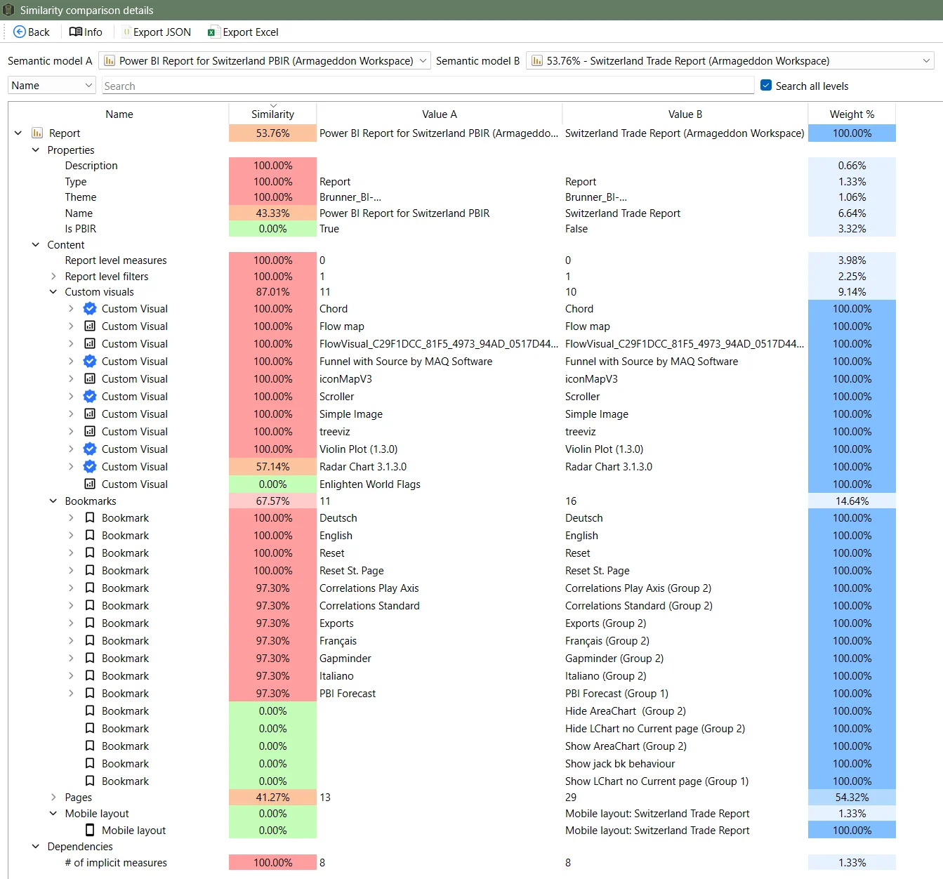
When comparing our Power BI Report for Switzerland PBIR with another report, the Switzerland Trade Report, we can see differences for custom visuals, bookmarks and the mobile layout of the report:
To change the weights or to disable some of the attributes that go into the score, click Adjust weights when selecting the reports (in the window before):
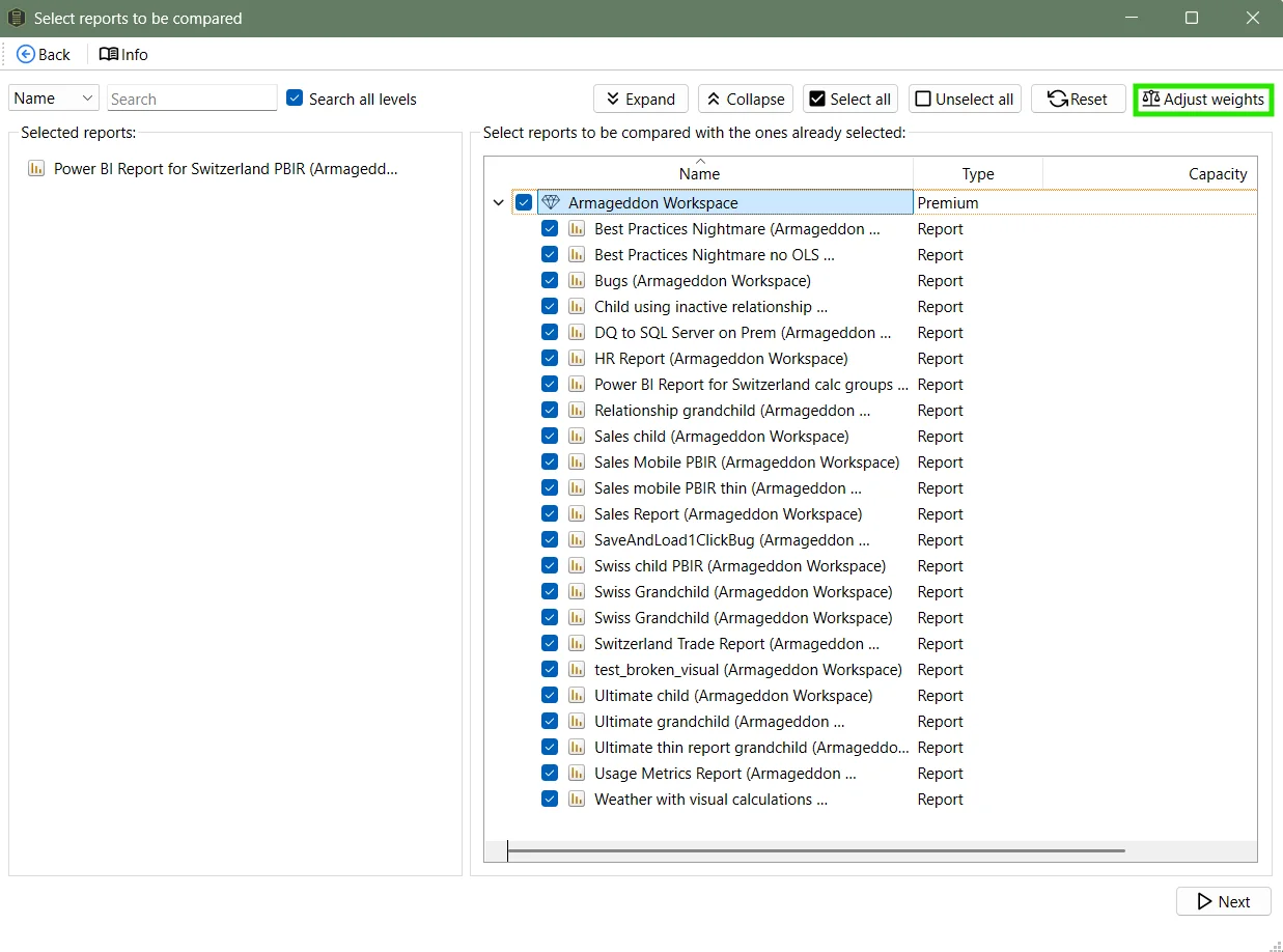
Here, the weights can be customized:
Final thoughts
Report Similarity provides an easy and customizable way to understand how similar Power BI reports are. By creating a similarity score, and also comparing every single item (every page with the best match in the other report, and so on), it lets you tailor the comparison to whatever your governance goal is.
If you want to try out the full version of Measure Killer, you can request a trial here.